How to Make Data on Census or Scientific Papers Interesting
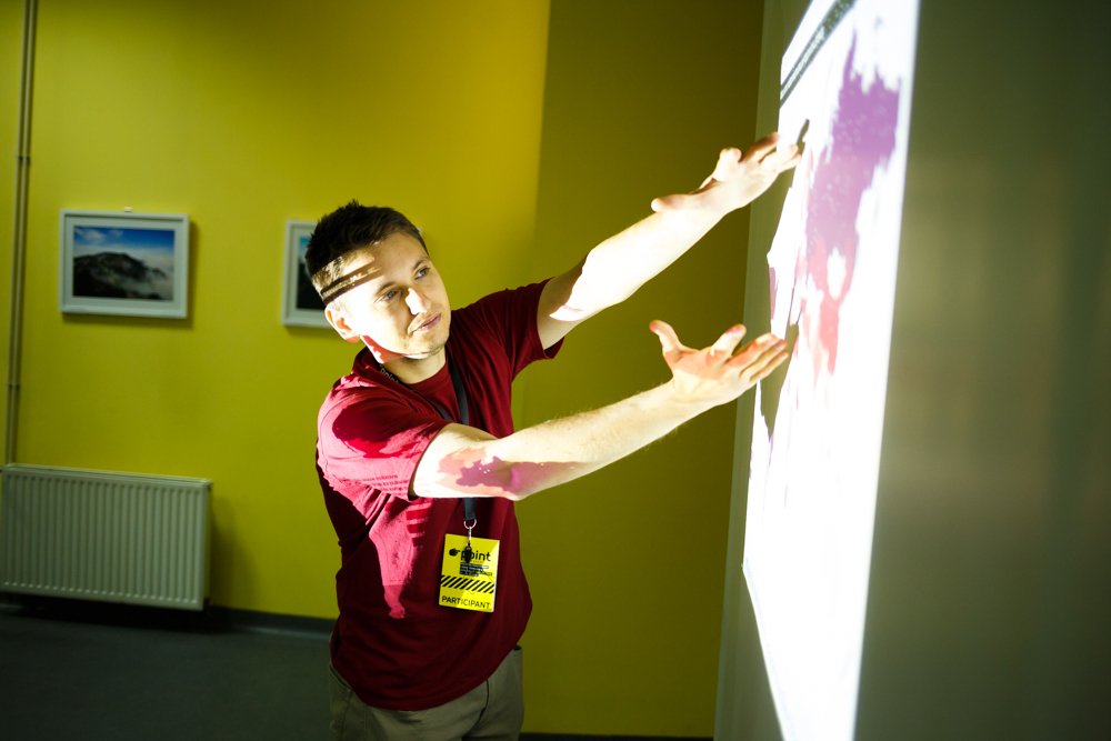 Srđan Keča and Uroš Krčadinac (UZROK, Serbia) are a part of enthusiastic group of 6 people, which is working on several interesting projects using data visualization to make positive social impact. Srđan and Uroš presented several of their already completed online applications, as well as their ambitious prototype, which is still in preparation phase.
Uroš says that their goal is to make visualizations which are readable and informative for the regular public, to make people think and become more informed, thus they strive to create visualizations which have immediate effect on people.
Synesketch is a textual emotion recognition and visualization software, which tries to recognize emotion in written text. The emotions are presented in colors – warm colors presenting positive emotions, while darker, saturated colors present negative feelings or events.
Paperista is a visualization and exploration tool for research papers. This tool was inspired by the desire to make research papers more interesting. It is made with HTML and Java script. Paperista is actually a “bubble chart”, consisting of semantic analysis of the text, which gives a list of the key words, with a list of papers on the right followed with popularity chart of the paper (and how the same changes over time).The tool also shows, over period of time, the changes in trends on research topics. In the future, they hope to apply this tool on bigger data sets as well.
At this time, these inspiring young “techies” are developing a prototype for data visualization of census results. They intend to accompany the visual data (results in numbers), with textual descriptions that would describe the context, interpret and explain true meaning of numbers by putting them in socio-historical context (by connecting, for example, the results on number of population with events that contributed to population growth or decrease, such as wars, migrations, etc.). Additionally, they plan to enhance this visualization by presenting projections for future trends and happenings.
Other than their tech/online work, Srđan and Uroš are also experimenting with more “physical” data visualisation. They have discovered an interesting technique of cooking magnets (yes, you read that correctly), which they plan to use to present data on air pollution through the medium of liquid magnets!
In conclusion, Uroš and Srđan emphasize that visualizations without stories are meaningless and providing relevant context is crucial for proper understanding of data visualization.
Check out their work @ www.Visualize.rs